 |
| Marco Macaco movie poster, 2012 |
With an average footage requirement per animator of 16 seconds (24 feet) a week, the animation is really quite good (not least thanks to the animation director Tonni Zinck). The backgrounds, mostly built in 3D, have been further enhanced by beautiful hand painting, giving this CGI feature a fresh style and unique atmosphere, which easily outshines movies with price tags many times higher.
The movie (released 2012) was produced by the Danish studio Nice Ninja, which also created the feature Sunshine Barry and the Disco Worms, released 2008 (back then the studio was called Radar Film).
Early Marco sketches by Jan Rahbek, 2009.
The studio wanted to do a teaser trailer to help finalize the funding for the feature project, so I did some quick sketches of various mouth shapes as inspiration for a simple temporary facial setup.
When Marco's model was finally in place, we needed to build a more detailed facial setup for the feature animation. Drawing on the lessons from the haphazard approach on the Disco Worms, where the individual blendshapes constituted full mouth expressions that were difficult to blend between, this time around a system was created in which each blendshape would only affect a limited part of the mouth. It would then take a combination of shapes to form a full expression, but also gave more detailed control of the mouth, and ensured better blending.
Of course, the expressions still had to be designed as a guide for the modeler to do the blendshapes. Here is a selection of sketches for Marco's expressions:
Here's a screen dump of the final Marco model.
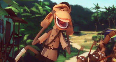
These are some stills from the movie, showing Marco's final appearance. The character modeling was done by Jimmy Levinsky, the rigging by Rasmus Rolfshøj.
Here is the official trailer for the movie (in English). For the Danish version of the trailer on YouTube click here.


No comments:
Post a Comment