Nocturna is an incredibly beautiful movie. It has that magic from the old Disney features, the feeling that you are simply there. This universe really exists. It sucks you in.
It's hard to deny that the character designs in Nocturna are pretty weird. Especially the main character, Tim, looks very odd indeed. Honestly, those designs are too artsy for my conservative taste. But the backgrounds, the colors and the mood of the film is just wonderful.
So when I saw the teaser on the internet back in early 2006, I just knew that I had to be part of this film. I contacted the Spanish animator Sergio Pablos, whose studio, Animagic (now SPA Studios), had made a substantial part of the animation on Asterix and the Vikings, which I also worked on a year earlier. Animagic was subcontracting on the animation for Nocturna, and I managed to get a piece of that action.
How such a good looking film was made on a EUR 8 million budget seems a bit of a mystery. Well, one explanation is probably the Spanish wages. I worked pretty hard, churning out some six seconds (nine feet) of animation per week, but still only made about a third of a regular Danish animator's salary, certainly not something you can live on in expensive Scandinavia. But hey, I've got scenes in Nocturna, that's what matters.
This is a linetest of a sequence that I animated with Tim and Tobermory the cat (carrying the star, Adhara, on its back) as they run across the bridges in the sky from which the stars of Nocturna are suspended.
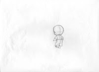
And here are some key poses of Tim from the last shot of the sequence. This character was quite difficult to draw, probably because his design was so different from what I was used to. As you can see on a few of the drawings, I had some difficulty getting Tim's head big enough. It took a couple of attempts before I got the model right and the animation director could approve the scene.
Nocturna offers some breathtaking shots of the city where the story takes place. This short sequence alone contained several incredibly beautiful background layouts. Regrettably, I only have scans of the two layouts below.
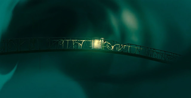
This is the bridge from the final scene of the sequence. It was a multi-plane shot with a level of another bridge underneath and severel levels of clouds above and below.
The first scene of the sequence includes this grand view of the city. I must have been a bit sloppy when scanning the layout, because the two parts don't overlap, so there is a blank stripe in the middle (I sent the original back to Spain). Anyway, I'm sure you can still appreciate its beauty. Sadly, the final color shot has been fielded in somewhat, and the remaining section is largely covered in clouds, which is a bit of a shame since you can't really make out the beautifully designed houses. But luckily, you can see them here :)
These are some final movie stills form the same sequence. It does look pretty amazing! See more backgrounds from Nocturna here. Final color video of the sequence at the bottom of the post.
Here is the final color version of the sequence. Beautiful stuff!


No comments:
Post a Comment